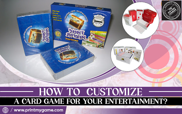
Graphic Design Tips for Eye-Catching Custom Game Cards
In the world of tabletop gaming, custom game cards can make or break a player's experience. Whether you're designing for a new card game or looking to customize an existing one, creating visually appealing cards is crucial. This guide will walk you through essential graphic design tips to ensure your custom game cards captivate players and enhance gameplay.
Crafting an Effective Layout
The layout of your custom game cards is the foundation of your design. Consider the following tips:
● Establish a clear hierarchy: Prioritize information based on importance
● Use a grid system: Create a consistent structure across all cards
● Leave breathing room: Incorporate white space to prevent clutter
● Maintain consistency: Ensure similar elements are placed in the same location on each card
By adhering to these principles, you'll create a layout that's both visually pleasing and functional for players.
Choosing the Right Typography
Typography plays a crucial role in the readability and overall aesthetic of your custom game cards. Keep these points in mind:
● Select legible fonts: Choose typefaces that are easy to read at a glance
● Limit font varieties: Stick to 2-3 complementary fonts for a cohesive look
● Consider font size: Ensure text is large enough to read from across the table
● Use contrast: Make important text stand out with bold or contrasting colors
Remember, the goal is to convey information quickly and clearly while maintaining visual appeal.
Developing a Compelling Color Scheme
Colors can evoke emotions, create an atmosphere, and help players quickly identify card types. When developing your color scheme:
● Choose a primary color: Select a dominant hue that represents your game's theme
● Add complementary colors: Use the color wheel to find harmonious combinations
● Consider color psychology: Leverage the emotional impact of different hues
● Ensure sufficient contrast: Make sure text and important elements stand out
A well-thought-out color scheme can significantly enhance the visual appeal of your custom game cards.
Creating Effective Iconography
Icons and symbols can convey information quickly and save valuable space on your cards. When designing iconography:
● Keep it simple: Use clean, easily recognizable shapes
● Maintain consistency: Ensure icons have a uniform style across all cards
● Consider scalability: Design icons that work well at various sizes
● Use color coding: Assign specific colors to different types of information
Well-designed icons can greatly improve the usability and aesthetic of your custom game cards.
Balancing Visual Elements
Achieving visual balance is key to creating attractive custom game cards. Consider these tips:
● Distribute elements evenly: Avoid clustering too much information in one area
● Use symmetry or asymmetry intentionally: Both can be effective when used purposefully
● Consider visual weight: Balance light and heavy elements across the card
● Create focal points: Guide the eye to the most important information
A well-balanced design will be more visually appealing and easier for players to process quickly.
In Conclusion
By focusing on layout, typography, color, iconography, balance, and depth, you can create cards that not only look great but also enhance the gaming experience. Remember to keep your designs consistent across all cards and always prioritize readability and functionality. With these tips in mind, you'll be well on your way to crafting a customize card game that players will love to use and admire.

.jpg)

Comments
Post a Comment